Made Up in Boston

"A man's face is his autobiography. A woman's face is her work of fiction." -Oscar Wilde
Showing posts with label Revlon. Show all posts

Monday, December 19, 2011

Berry Colored Lips!

One is a dark, proper berry, while the other is a bright pop of shimmering pink. Both are gorgeous.

NYC Berry Rich is a deep hued berry lipstick that gives lips that "I just ate a bunch of blackberries" stain. It isn't super pigmented, and the finish is a dull satin, but a nice slick of the product across the lips leaves just a hint of the luscious berry color. It's a very wearable color (safe even for daytime) and it's currently my go-to lipstick for the holiday season.
Downside to this lipstick? Well, it's cheap. It cost me $2.00. And, well, the quality shows.
One night living in my purse's makeup bag, and BOOM! Toast. 

Yeah. I said it was cheap.

Next up is one of the famed Revlon Lip Butters in Berry Smoothie. These babies have been all over the Internet for months. Initial demand for these lipsticks was insane, so they were really tough to find for a long time. I finally found a kiosk in my local CVS and pounced on it. The colored tube seemed a lot brighter than I might normally gravitate to, but I loved the bright, rich pink in the tube.
Not even Kitty is immune to the charm of the lip butter!
The formula is very slick, and leaves the lips feeling like they're wearing balm. I didn't expect the color to be as saturated as it turned out to be, but once on, the color is simply gorgeous! Young and fun and very eye-catching!

I love this color, but the formula's longevity leaves something to be desired in my opinion. I feel like I need to reapply it almost every hour. The slick, chap-sticky formula fades pretty quickly and leaves my lips feeling a tad bit sticky. Not enough for me to stop using it, but enough that I notice it and find it slightly annoying.

Have you tried the Revlon Lip Butters? Do you have a favorite shade? Share your favorites in the comments! :)


Monday, August 15, 2011

Review: Revlon Metallic Nail Polish in Silver Dollar

Chanel is known for its unbelievable nail varnishes. Over the past few years, shades like Blue Satin, Black Pearl, and Peridot have pretty much flown off the shelves. This season, Graphite is the newest addition to the Chanel nail varnish family. It's a dark, cool-toned nail polish that glitters in a way that is unmistakably Chanel. It's gorgeous.
I love a good nail polish just like any other girly girl (especially a glittery nail polish!), but I just refuse to pay upwards of $20 for a small bottle of polish. No way, no how. Fortunately for me, Revlon follows trends very well and it never takes long for them to roll out a cheaper alternative to the season's must-have shade.

Meet Silver Dollar.
Silver Dollar is one of three metallic shades in the new Heavenly Metallics series from Revlon. NY Fashion Week has faithfully shown us that metallics are the It look for Fall 2011, so Revlon is wisely jumping on the couture bandwagon and following suit.

Like Graphite, Silver Dollar is a very sparkly, opaque shade. It only needs two coats, and it applies like a dream. It spreads well and dries super fast.
I sealed the color with a non-chip top coat from Revlon and went about my business. It still looks fresh and brand new hours later.
Unlike my last Revlon experience, this nail polish is a major home-run! If the $25 bottle of Chanel is way out of your budget, then I definitely recommend that you check Silver Dollar out. It's a great dupe and you'll be ready to go when we go crazy for metals in the Fall!

Tuesday, July 26, 2011

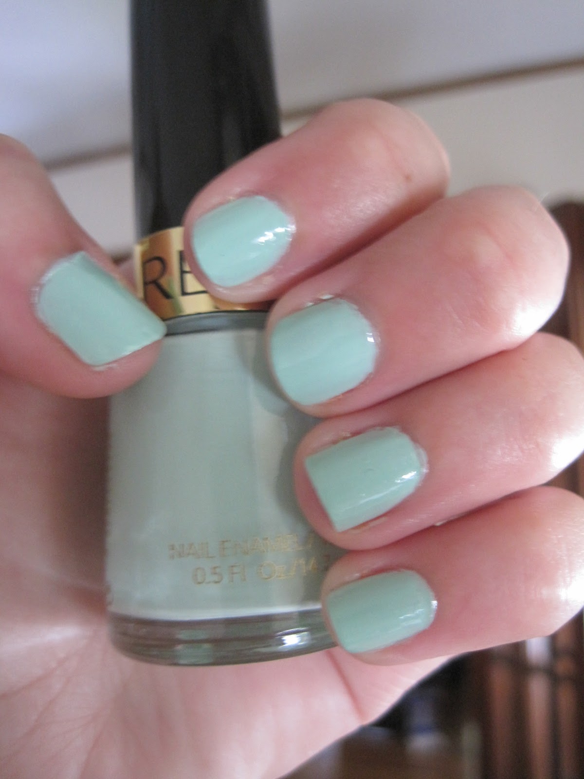
Revlon #85: "Minted" Nail Polish Review

The beauty blogosphere has been ablaze with reviews of Essie's Mint Candy Apple nail polish for months now.
Mint Candy Apple was released as part of Essie's 2009 Winter collection and has since become heavily covetable. That means the color is nearly impossible to find in drugstores, and I definitely don't have the patience to wait while sites like Amazon and ULTA restock their products.

I'd read that Revlon recently made a similar shade called "Minted" and that it was almost always easy to find in CVS and Walgreens. Unfortunately the reviews for "Minted" haven't all been favorable, so I wasn't really in the mood to spend $6 on a product I was already hesitant to try. However, I recently found a $5 off coupon and so I decided to pick a bottle up the next time I came across it. For $.84 I felt I couldn't complain if it turns out to be a total bust.
In the bottle this shade is a very pale sea foam green color with white and blue undertones. It's a suede finish, meaning there are no small glitter particles in the formula. Which is really the only positive thing about this formula.

The rest is crap, for lack of a better word.

"Minted" = Nail. Fail.

It's incredibly watery and streaky. I had to apply five coats before I had opaque color. The formula doesn't dry quickly, but rather becomes extremely tacky. The brush also adds to that problem, because it tends to grab the previously applied tacky polish and pulls it back off the nail bed.
(My nails after two coats)
(Five minutes after applying, and still tacky!)
I really wanted to love this polish. The color is really pretty and in theory should look wonderful. Unfortunately, it was messy to work with and just took too many coats just to achieve the color as it appears in the bottle. 
I will say that I've owned many Revlon nail polishes before (I love, love, LOVE Siren!) and they've always been fine, but this particular polish is a total miss for me. I suppose it is workable if you're patient and committed to building the color. I don't know that I am, so we'll see if this polish hangs around or ends up chucked in the waste bin.

I totally should have bought a Hershey's bar with that $.84. That certainly wouldn't have gone to waste ;)

What nail polish brand do you use? Is there a nail color you're dying to try?

Friday, June 10, 2011

Duping the Duchess!

Well, her makeup anyways.

(Please forgive me if I sneak one more post in before my trip :) ).

Last night the Duchess of Cambridge (who we all know I love) attended some swanky to-do in London. Besides drooling over her ridiculously beautiful Jenny Packham dress and LK Bennett shoes, I thought she wore simple but very flattering makeup.
(all images are from the Daily Mail)
What I loved most about her look is that it wasn't very complicated at all. She kept everything neutral and no one feature stood out from the others; the eyes, cheeks, and lips were all in harmony. It's normally considered a bit of a risk to wear such understated makeup to a red carpet event, because the whole point of the red carpet is to be oogled and stick out. But Kate is famous for always looking natural, and one should never mess with what looks best on them, a rule she seems to have embraced. She looks amazing, and I knew it would be so easy to copy this look with only a handful of products:

  • Two eyeshadows
  • Eyeliner
  • Mascara
  • Blush
  • Lipgloss
The eyes are very simple: it's nothing more than a mauve-pink eyeshadow blended up above the crease, where it's blended with a frosty baby pink highlighter immediately beneath the brows. There are obviously lots of different shadows you could use to recreate this look, but I thought of five shadows right off the bat that perfectly match the warm, plummy undertones tones of Kate's look.
L to R: MAC Satin Taupe, MAC Haux, MAC Shale, Revlon CS Sterling Rose (the frosty pink shade), and L'Oreal Lavender Smokes shadow #2.

I decided to use the L'Oreal's Lavender Smokes quad (specifically shadow #2), a beautiful but very subtle mauve shadow. I chose it because it's a warm pinky-purple that looks amazing on green eyes (something I have in common with the duchess, and a feature I love to play up as much as I can). This shadow looks like suede once applied to the lid. It's a very soft, matte color, which is in line with Kate's makeup in that there is hardly any shimmer on the lid. Keepin' it simple, people.

I blended the mauve shadow out with my Sephora Professionnel rounded crease brush, bringing it right up to my brow bone. Because I have hooded eyes, I like to bring the color up as high as possible, because color tends to disappear when my eyes are open. Then I blended the frosted pink shadow from the Revlon CS Sterling Rose quad beneath my brown bone and into the inner corners of my eyes (pro-tip: this makes the eye look more open and awake).

I know Kate loves her eyeliner, and so do I, so of course I gave myself a healthy outline on the top and bottom lashes using Revlon's CS black liner before applying two coats of L'Oreal Voluminous Mascara in Carbon Black.

The goods:
For my cheeks I just applied a warm peachy pink blush from the E.L.F. bronzer and blush duo, and for my lips I used a Victoria's Secret brilliant shine lipgloss called "Mischief."

And this was the finished look:
Simple, flattering, and best of all, it only took five minutes from start to finish. I'm sure Kate's makeup took a bit longer than that, but five minutes works for me!

Do you ever admire someone else's makeup?

Saturday, May 21, 2011

It's the end of the world as we know it...

But at least I look cute.


I decided to go with a relatively natural look today. The sun is shining for the first time in days, and a sunny spring day always makes me want to go that one extra inch when doing my makeup. If the sun can be so bright and shiny, there's no reason I shouldn't do the same! :)

This FOTD was pretty easy to pull together. I mixed a few palette shadows together to create something that bordered on pale pink bronze with taupe undertones.

Shadows used:

  • E.L.F. all-over color stick in Lilac (FYI, these make great primers; on their own they make lousy cream shadows)
  • The rose pink from my new Inglot palette
  • MAC Honey Lust
  • Physician's Formula shimmer strips for hazel eyes (review here)
  • Mascara is CG's Lash Blast Fusion
  • Liner is MAC's Technakohl in Graphblack (I killed it on this look. RIP best eyeliner ever :(  )


The lipstick is one of my newer acquisitions. I've had it for a few months now, but I'm on the fence as to whether or not I'm a fan.

This is Revlon's Pink in the Afternoon, well known because it was created specially for Audrey Hepburn. This was apparently her signature lipstick color, and she wore it in almost all of her films, most famously in "Breakfast at Tiffany's".


I ask you: who the hell DOESN'T want to look like Audrey Hepburn? I absolutely do! Unfortunately, I don't think this lipstick is gonna turn me into Holly Golightly any time soon.


Pink in the Afternoon is supposed to be a creme finish lipstick, but there isn't a lot of moisture to this formula. It comes off as more matte, and it leaves my lips feeling dry after only a few minutes of wearing it. It also doesn't spread very well. As for color, the pigmentation is good, but it's also very different on lips than it presents in the tube. Once applied to the lips, there are obvious bright peach and beige undertones that look quite odd against skin with cooler undertones.

I combated this by applying a cooler, dark rose-hued lipgloss over the lipstick. Specifically, I used Rimmel's moisture renew lipgloss in Rose Cocoon. It toned down the peach and brought out the beige, but it's still a bright color nonetheless.

It's not a bad color; in fact, it's very pretty in the tube. I just think it does not do any justice on me. That's always so disappointing: falling in love with a colored sticker, and absolutely being underwhelmed once you've tried it out.

Have you ever had high hopes for a lipstick color, only to be less than impressed once you try it out? How much does the hype of a color play into your impression of it?

And on one last note, here is today's necklace:
I figure if the world really does end today, it's better not to take any chances...

Sunday, April 17, 2011

Review: Revlon Sterling Rose CS e/s

I'd like to start this post by pointing out that I spent a grand total of $.13 on this eyeshadow palette. Yeah, you read that right. $.13. I am officially the makeup bargain queen.

If you're not familiar with this line, I should offer a bit of background info before I get into this review. Revlon's ColorStay 12 Hour Eyeshadow quads have long had a reputation for being being long-lasting, well-pigmented, easy to blend, and just really workable shadows in general, especially for a drugstore brand palette. I used the Berry Bloom palette in college and remember loving the bright, vibrant pinks and purples in that quad. My love for that palette, combined with the positive experiences I've had with the ColorStay line since (the foundation and liner pencils), really influenced this newest purchase.

What I really enjoy about this line is that the ColorStay shadow quads come in a wide variety of colors. Depending on your personal preferences, you can choose a subtle color set or something more bold. Normally, I find that drugstore palettes tend to be a hodgepodge of colors that on their own might be pretty, but somehow just don't work well together (I'm looking at you, CG!). However, the Revlon shadow palettes actually seem like they could be interchangeable, so you can mix and match which shadows you pair together.

I was immediately drawn to the Sterling Rose quad because the colors just looked so classic. It reminds me of Chanel's Enigma quad, which is one of my favorite shadow combos of all time. There's a delicate champagne shadow that works fantastically as a  highlighter, and a great pale rosey pink that has the slightest undertones of gold and bronze to it. There are also two darker shades as well, namely a silvery lilac that works wonderfully in the crease (or as a lid color, if you want), and a darker charcoal-brown that makes for an amazing liner. What's also interesting to note about this palette is that the colors are actually really neutral once they're on the eye, despite the varied undertones in each shadow.


How cute is the embossing on the shadow? Damn packaging. Gets me every time.

I love the texture of these shadows. They're powdery, to be sure, but they're also really smooth and silky, and they blend beautifully. There's no real filler in this formula so you're not going to end up with large amount of fallout or random particles on application. 

I swatched each shadow so you can get a good idea of how they look if you were to use them as dry or wet shadows. I also didn't use a primer, so these colors are exactly what you'd get if you just applied them on their own.

                                           
                                                                                Dry swatch
Wet swatch

What I love best about these colors is that they are just so blendable, you can wear a subtle smokey eye during the day because the colors aren't too overpowering.                                           

Look at how wonderfully the shadows blend together! *Love*

So suitable for work.


And it doesn't take much to transition these shadows into a night time look, either. Build up the lightest shades, use a fluffy brush to blend, then just add a touch more of the darkest shade as a winged out liner, and there you go; a sexy smokey eye using rather neutral shades. If you're into major drama with your makeup, you could draw that winged V further out and create a really interesting cut crease (not necessarily my thing, but more power to you if it is).

True to the name, these shadows do last a long time and unless you're intentionally darkening the colors, you don't need to reapply like you might with other drugstore products. They don't crease, they don't streak, they don't budge. Period.

The one flaw I have found with this product so far is the actual package the product comes in. The plastic container feels super flimsy and I'm worried it could crack if I don't baby it.

All in all, I highly recommend checking the ColorStay shadow quads out if you're so inclined. The price is great ($5-$8, depending on individual drugstore pricing), and the color payoff is really fantastic when you consider how much you can play around with the shadows during application.

Grade: A. 

Wednesday, February 16, 2011

Putting three notches in my lipstick case

In general, I don't wear lipstick. Typically, I'd slick on some gloss and go about my business. However, my love for that delicately thin smear of shine is never enough to distract me from the things I also hate about lip gloss: the tacky feeling when the gloss wears off, the subtle flavor of plastic, and the hair that inevitably sticks, well, EVERYWHERE the second it comes into contact with the goopy stuff.

So in embracing my inner glamor girl, I slowly but surely began segueing into lipsticks. In my mind, I picture myself all Rita Hayworth-like: full, pouting red lips, with a cocky little smile that you just know is hiding lots of naughty secrets. The reality, however, is not so close to the dream.

There is a catch, though. Lipsticks can be risky. Far riskier than a lip gloss. With gloss, the small wash of color usually tells you what you're going to get, but with lipstick, all bets are off. What looks one way in the tube might be completely different from what ends up on your mouth.

 Left to right: L'Oreal's Gilded Pink, Revlon's Cherries In The Snow, Cover Girl's Baby's Got Lips

Case in point: Revlon Super Lustrous lipstick in Cherries In The Snow.

I wanted to try this color after reading rave reviews from www.makeupalley.com. Lollipop26 also had a great write up about it. So one quick drugstore trip, and voila! One tube of Cherries In The Snow to go, please.

In the tube, this is a lovely ruby red shade with fuschia undertones. One the mouth, this baby is bright pink. We're talking borderline neon. This is a mouth that will get you noticed, if that's exactly what you're going for. Mark my words, there is zero subtlety to this lipstick. I want to love this color, but frankly I'm not sure that I'm sold on it.
Pow! Right in the kisser!

The formula is lovely. It glides on smoothly, wears for quite a long time, and doesn't have that icky lipstick smell. It's just a bright-enough-to-give-me-a-headache color.

To be fair, though, I've also acquired some lipsticks that don't go all chameleon on me.

L'Oreal Colour Riche lipstick in Gilded Pink:

This is more my speed. This is what I refer to as, "my lips, but better." Gilded Pink is a beautiful nude-pink with a slight gold shimmer. I'd say this is a highlighter for your lips, and not a straight-up lipstick. It isn't going to make a drastic change, but it will certainly give what you already have a little boost.

Nothing great about the formula. It isn't super smooth, but it doesn't dry out easily, either. Terrible smell though, but truly, I think the smell is just the staple of any L'Oreal product.

The last lipstick up for review is Cover girl's Incredifull lipstick in Baby's Got Lips.

I wore this lipstick on my wedding day, and I loved it. It leant itself beautifully to photos and didn't require constant re-application. Baby's Got Lips is a gorgeous lavender-pink-chocolate hybrid with tons of glitz. The glitz can mean that the initial texture is grainy and at times dry, but the formula takes well to warm lips and smooths itself out quickly enough. Bear in mind, white teeth are essential to the wearing of this shade. It can highlight the yellow undertones of teeth, which as we all know is super attractive, amiright?

Unfortunately, Cover Girl no longer manufactures the Incredifull line, but determined beauty hounds can easily sniff out a tube on Ebay or Amazon.

I've already got my little green eyes on a few other colors, some neutral, some obnoxious, but all girlishly exciting.